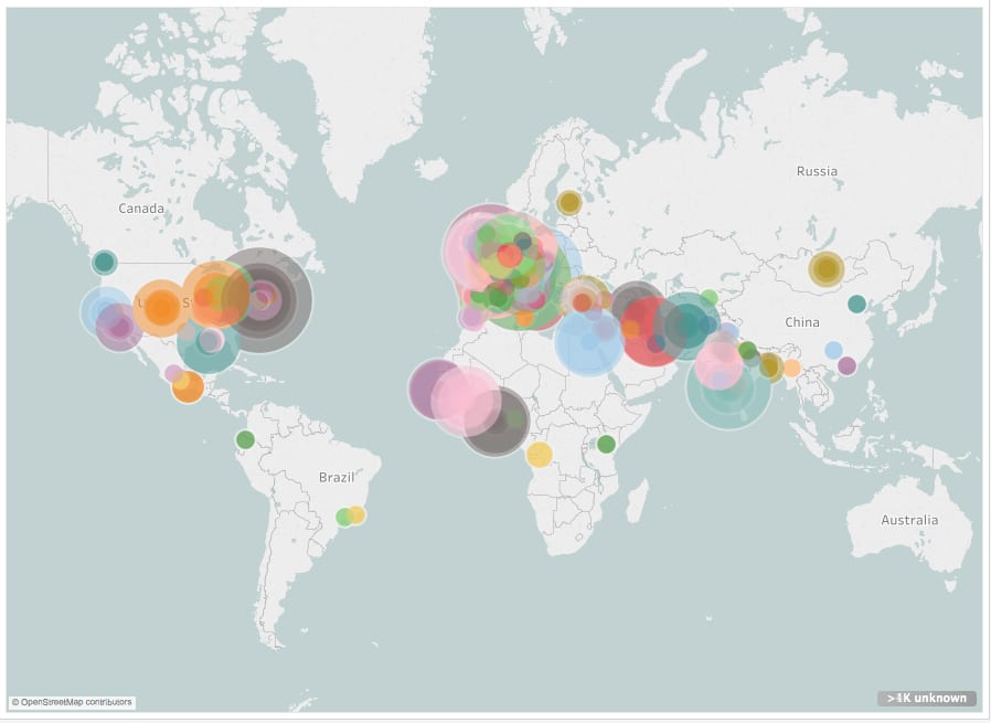
Where in the world is modernism?

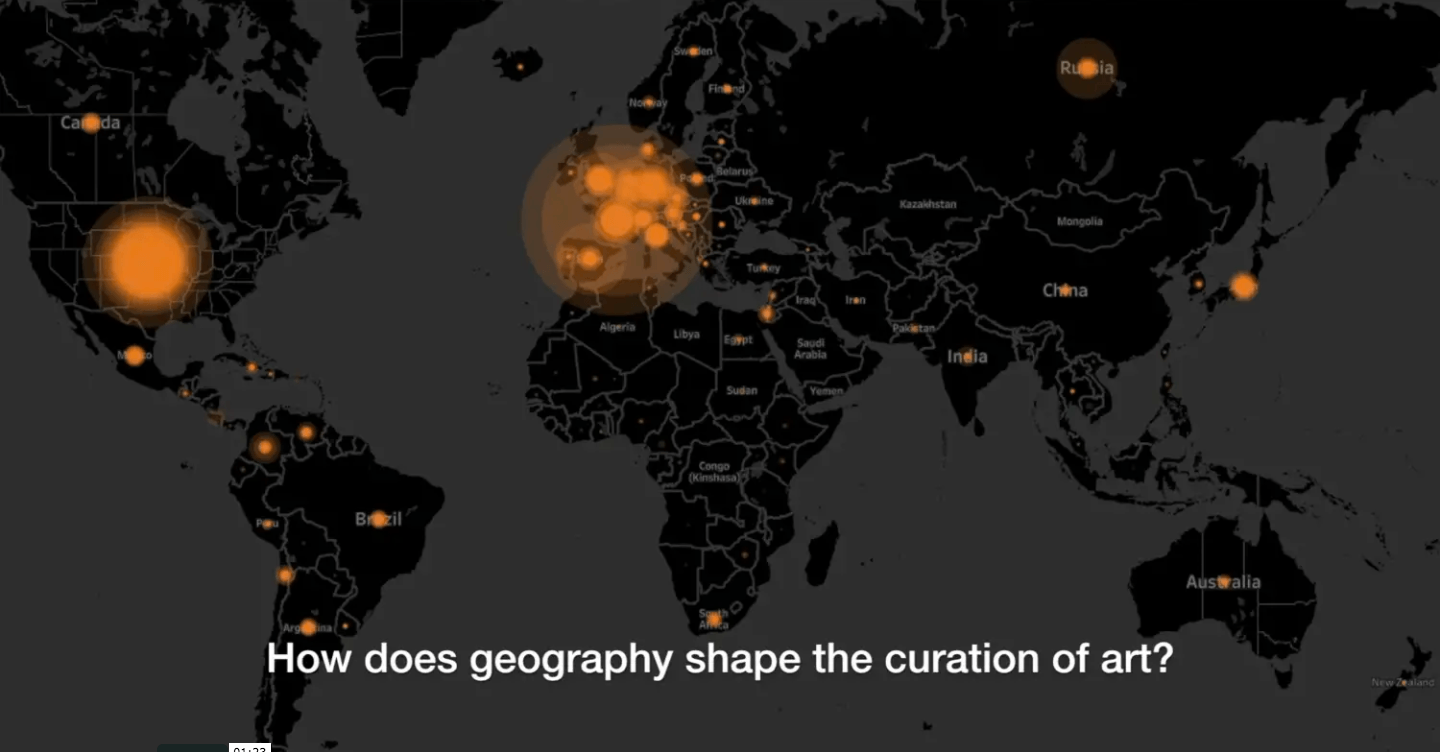
What if the nationality of every artist represented in the Museum of Modern Art’s collections were mapped to illustrate the museum’s evolving geographic diversity from the 1920s to today? Watch this data visualization that shows the provenance and geographical origins of 121,823 works of art selected from MoMA’s collections. Explore supporting data visualizations and interactive dashboards. VIEW PUBLICATION >

The Geography of Art History

According to the Metropolitan Museum of Art Related: Data analysis and visualization of 120,000 works in the Museum of Modern Art In this film, each colored dot indicates one location represented by art in the Met’s online database. Dot location indicates artwork provenance. Dot size indicates the number of objects from this place. The time each dot appears corresponds to the year this work was created. This data is assumed to be an accurate sample size. Over the past few years, the Metropolitan Museum has catalogued over 25% of its holdings online. This represents ~590,000 objects, covering over 5,000 years… VIEW PUBLICATION >