What if the nationality of every artist represented in the Museum of Modern Art’s collections were mapped to illustrate the museum’s evolving geographic diversity through time?
Watch the data visualization below of 121,823 works at MoMA.
Introduction
“The Museum of Modern Art (MoMA) acquired its first artworks in 1929, the year it was established. Today, the Museum’s evolving collection contains almost 200,000 works from around the world spanning the last 150 years. The collection includes an ever-expanding range of visual expression, including painting, sculpture, printmaking, drawing, photography, architecture, design, film, and media and performance art.
“MoMA is committed to helping everyone understand, enjoy, and use our collection. The Museum’s website features 79,870 artworks from 26,215 artists. This research dataset contains 135,804 records, representing all of the works that have been accessioned into MoMA’s collection and cataloged in our database. It includes basic metadata for each work, including title, artist, date made, medium, dimensions, and date acquired by the Museum. Some of these records have incomplete information and are noted as ‘not Curator Approved.’
“The Artists dataset contains 15,757 records, representing all the artists who have work in MoMA’s collection and have been cataloged in our database. It includes basic metadata for each artist, including name, nationality, gender, birth year, death year, Wiki QID, and Getty ULAN ID.” – from MoMA’s website and mission statement.
I downloaded this dataset and dissected it with this question in mind:
What trends might this dataset reveal about the history of curating and the growth of a museum’s collections?
In the three interactive features below, hover over the graphs to explore the data in depth.
1. Geographic and Gender Diversity
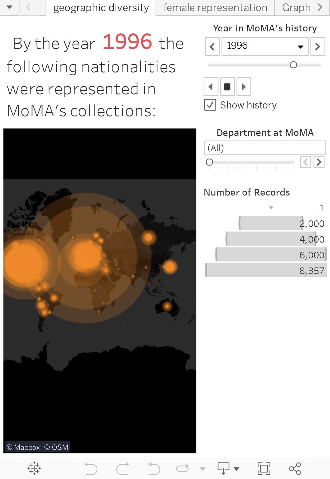
This map visualizes the nationalities of ~15,757 artists whose work is displayed at MoMA. There are 121,823 data entries displayed below. The data can be browsed by year or by department. This illustrates the evolving geographic breadth of collections. Beginning in the 1930s, over 80% of artworks were from the four key countries of the US, UK, France, and Germany. Beginning the 1960s, the museum acquired some of its first works from Latin America and Japan. Post-1991, the museum acquired the bulk of its collections from Russia and China. Recent years have also seen a slight growth in collections of African art
An important distinction: This map does not show where each artwork was made. Rather, it shows where each artist is from. Nationality and national identity are, depending on the artist, an important influence shaping the unique perspective artists bring to their work.
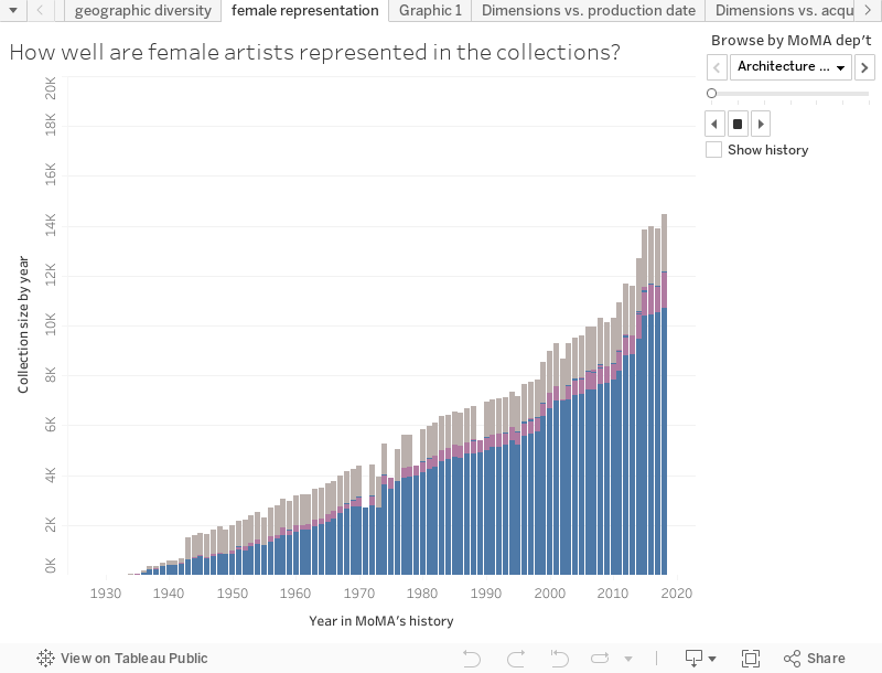
The bar chart below shows the gender distribution of artworks by date. On the horizontal axis: the date acquired. On the vertical axis: the number of artworks acquired in this year. Each bar is divided into three colors: Blue for artwork by a male artist. Pink for art by a female artist. Grey for art where the gender of the artist is not known.
This data can be explored by year and by department. Across departments, male artists represent the clear majority. The departments with the greatest number of works by female artists: Photography and Drawings. The department with the least female representation: Prints & Illustrated Books. The department with greatest number of works where the artists’ gender is unknown: Architecture & Design. However, across departments, the representation of female artists has slightly increased over the past few decades from around zero to somewhere around 20%.
2. Do newer acquisitions tend to be smaller?
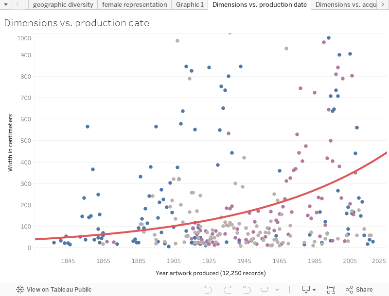
The two graphs below plot the relationship between year produced, year acquired by MoMA, and the dimensions of each artwork (width in cm). I’ve plotted 12,250 points. They are color coded with the same blue, pink, and grey system as the previous chart.
In the first graph, we see that newly produced paintings are becoming progressively larger. In 1929, the year of MoMA’s founding, the width of the average painting being produced was less than 100cm. Today, the average width of newly produced paintings is around 400cm – and is steadily increasing.
In the second graph, we see that MoMA’s new acquisitions are becoming progressively smaller, even though newly produced artworks are larger than before. In 1929, the average width of a new acquisition was over 300 cm. Today, the width is less than 150cm.
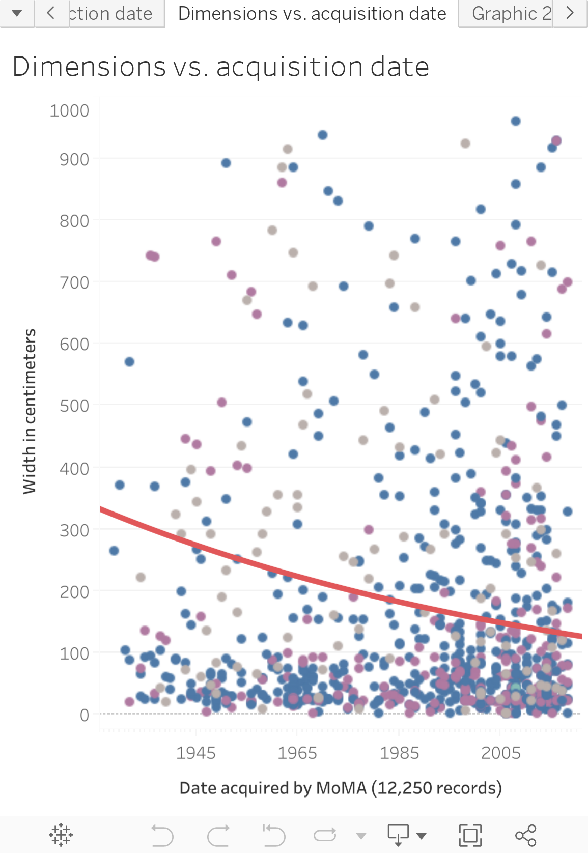
In other words, while artists seem to be working in ever larger dimensions, MoMA seems to be acquiring ever smaller paintings from these artists. Have the growing costs of buying and storing art priced MoMA out of acquiring larger artworks? What is the relationship between size and the decision whether or not to acquire a work?
3. Is the scope and definition of modernism expanding?
The challenge facing any museum dedicated to modern art is keeping up-to-date. Modern art is constantly being produced. Like any leading museum, MoMA is:
growing its collection of newly-produced contemporary works
while also enhancing its collection of older works
and expanding the geographic and national representations of artists and artworks
The graph below compares the relationship between production year and acquisition year for 7,797 data entires. Dot size indicates the size of the acquisition (i.e. number of pages or number of paintings from said artist). The red trend line indicates the linear relationship between when a work was produced (vertical axis) and when it was acquired by MoMA (horizontal axis). The vertical gap between the trend line and the upper reaches of the graph indicates the time elapsed between when the work was produced and when it was acquired. With time, the number of years elapsed between production and acquisition has grown.
In 1929, most new acquisitions were produced in the 1920s – modernism was a new movement and a new idea. Today, new acquisitions range in date from the early nineteenth century through present day. The temporal definition of modernism is growing, with origins that stretch ever further back in time.
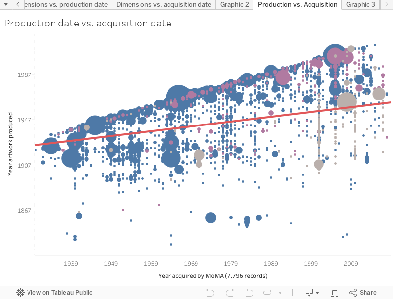
Modernism is not geographically restricted. With globalization and the march of capitalism, the world is becoming more modern and interconnected. As new regions adopt modern technology, materials, and ideas, the character of art and artists will change. Cultural institutions, particularly modern art museums, are positioned to curate these global trends through the kinds of works they acquire and display. However, the kinds of stories museums and curators can tell are limited by the size and diversity of the collections available.
Related Data Projects
History of the Metropolitan Museum of Art’s collections
History of landmarks preservation in NYC
The urban development of NYC from 1609 to the present-day
Sources
Download MoMA’s data from GitHub. The analysis above reflects this dataset as of 17 October 2018. New entries after this date are not included as these infographics are not updated in real-time.
Download my analysis of this data and the infographics above from Tableau Public.