• This website includes dozens of videos, hundreds of essays, and thousands of drawings created over the past twenty years. Search to learn more about the history of buildings, places, prisons, Newark, New York City, and my PhD research on spatial inequality.

Homesteads to Homelots

The history of New Jersey suburbs as told through five data visualizations

.

View of the city from the suburbs, author’s panoramic drawing of suburbs with urban skyline in the distance

.

“The state of New Jersey offers an ideal setting in which to analyze the distinctive residential landscape of mass suburbia. [….] In time, 70 percent of the state’s total land area would qualify as suburban, so that by the turn of the twenty-first century New Jersey and Connecticut shared the distinction of being the nation’s most suburbanized states.”

.

– Lizabeth Cohen, “Residence: Inequality in Mass Suburbia” in A Consumer’s Republic, p. 197.

.

Northern New Jersey has long been central to the history of America’s suburban growth. From America’s oldest suburban developments to its most homogeneous to its most diverse, New Jersey’s 565 municipalities span the full portfolio of suburban living arrangements. New Jersey is unique in the sheer number of municipalities, each with its own elected leaders, school district, police, fire, and land use policies. As a result of inefficient and often duplicate public services in competing suburbs, New Jersey has some of the highest property taxes and cost of living in the country. This problem is not unique to New Jersey; it affects the country at large in dozens of other places. So the story of New Jersey makes for a powerful and revealing case study of larger trends in American suburban history.
This analysis examines New Jersey census data from 1940 to 2010. It is not the end point or a full analysis. Instead, each of these data visualizations plots a direction for future research. Telling history through maps and data reveals the history of a larger region and country, in ways that granular analysis of individual places cannot.

.

Method

With data from the US Census Bureau, I extracted details on the population of every New Jersey municipality from 1940 to 2010, the period of greatest suburban growth. With spatial data on municipal boundaries from the NJ Office of GIS, I plotted the census data onto the map of municipal boundaries. This allowed me to see spatial patterns and to produce heat maps of population change over time. The spatial data also revealed the surface area of each municipality, which allowed me to calculate the historical population density of each municipality as a function of municipal population divided by municipal surface area. You can browse all the data visualizations or download the open source data here from Tableau. These data visualizations represent analysis of about 13,560 data points for 565 municipalities over eight censuses.

Read More

.

Book Review of “Saving America’s Cities”

Lizabeth Cohen. Saving America’s Cities: Ed Logue and the Struggle to Renew Urban America in the Suburban Age.
New York: Farrar, Straus and Giroux, 2019. 547 pp.

.

The memory of mid-century urban renewal will always evoke images of the bleak brick towers and windswept plazas of crime-ridden public housing. Urban renewal projects airdropped into the city fabric caused demolition and dislocation. This colossal failure has been epitomized by Robert Moses’ automobile-oriented vision of New York City. The Power Broker by Robert Caro described Moses stubbornly going alone to remove 1,500 families and pave the Cross Bronx Expressway through their vibrant neighborhood.[1] By contrast, in The Death and Life of Great American Cities, Jane Jacobs vividly described a sentimental city life with lively streets of safe neighborhoods. Pedestrians stroll along short city blocks while residents watch from brownstone stoops in her quaint Greenwich Village alleys.[2] The two polarized visions of activist Jacobs vs. authoritarian Moses have set the terms of the debate on city design and, by extension, about the government’s role in structuring urban life. Lizabeth Cohen, a Harvard historian of twentieth-century America, critiques the current dichotomy: “The lack of subtlety that I have lamented in current historical understanding of postwar American urbanism stems partly from its frequent framing as a monumental battle between the clashing visions of the villainous Robert Moses and the saintly Jane Jacobs.”[3] Between these two schools of thought, Cohen introduced the largely forgotten “Master Builder” Ed Logue to dispel misconceptions about urban renewal.
Logue serves a curious alternative to the polarity between Jacobs and Moses. Despite her biographical focus, Cohen does not lionize Logue’s dedication, but recounts his lifetime of successes, false starts, and imperfections. Logue came from a Philadelphia working-class family with an Irish Catholic background. Serving as a bombardier during WWII, he first experienced a top-down city vision from the air above Berlin and Dresden. Trained at Yale with a full scholarship, Logue was committed to the New Deal idealism of government serving the public good. His life, however, demonstrated how even the best of planners could not get the ill-conceived legal framework behind urban renewal to work most of the time. One reviewer of Cohen’s book asks in Architect Magazine: “How could such a clear-eyed, honest, and progressive guy, talented at getting lots of money from the federal government, oversee so many disastrous projects?”[4]
Through New Haven, Boston, and New York City, Cohen traces Logue’s city planning career of working against far larger anti-urban political and social forces. During his time in New Haven (1954-60), Logue planned to rescue the falling city by bringing suburban shoppers downtown. He built the Oak Street Connector for shoppers’ automobiles. This highway stub severed the urban fabric with an asphalt band of parking lots and uprooted a largely low-income Black community. However, Logue’s Chapel Square Mall in downtown New Haven, with indoor shopping and garage parking, never brought in enough enthusiastic suburbanites to survive against competing forces of anti-urban decentralization. What Logue called a “pluralist democracy” in New Haven planning actually relied more on experts’ work than on input from affected citizens.
Touting his approach of “planning with people,” Logue worked in Boston (1961-67) to break the city’s thirty-year economic stagnation. Unlike in New Haven, Logue created a “negotiated cityscape” of old and new in Boston and preserved some of the oldest architecture, such as Quincy Market. However, his ambitious Brutalist inverted ziggurat of the Government Center, next to a desolate brick-paved plaza, evoked an oppressive aura. His successful housing projects, particularly in the African-American Roxbury neighborhood, defied James Baldwin’s characterization that “Urban Renewal means negro removal.”[5]
Logue’s next career move (1968-75) landed him in New York City to lead the Urban Development Corporation (UDC) for 33,000 residential units, including thousands of affordable housing. After the “long, hot summer of 1967” with riots in 159 cities, President Nixon formulated his “suburban strategy,”[6] by appealing to suburban Whites’ fears of the inner city and Black insurrection. In a hostile climate, Logue encountered his political match from suburban residents. The wealthy Westchester towns vehemently opposed Logue’s attempt to place middle income and affordable housing in their backyard. The downward spiral of urban America became unstoppable. Neither urban renewal, nor affordable housing, nor highway construction could restrain the core middle urban tax base from driving away to the alluring American dream of “little boxes on the hillside,”[7] with “a chicken in every pot and a car in every garage.”[8]
Ousted from UDC, Logue settled for the final stage of his career (1978-85) at the South Bronx Development Organization. To revive the South Bronx with affordable housing, Logue no longer turned to demolition, as the urban fabric had already been devastated by arson, blight, and White flight. Logue recognized that the government had ceased investing in shopping malls, city halls, or intensely designed architecture. Instead, as if admitting the defeat of high-density urban development, Logue worked with residents to rebuild formerly urban Charlotte Street along suburban models of prefab homes with white picket fences. In a thriving nation of suburbs, the suburb had now come to the city.
Logue’s career capstone in the South Bronx was not polished architecture that he preferred, but the development that people desired. Community participations brought all stakeholders to the table, as Logue increasingly practiced. Over time, he realized that the top-down approach taken by urban redevelopment experts had serious limitations. People in the affected neighborhoods deserved to realize their vision of urban communities diversified with respect to income, race, and age. Their voices were the best insurance for equitable services for schools, transportation, retail stores, and affordable housing.
As Cohen asserts, Logue and urban renewal defy fast judgments. Across each decade, and in each of those three cities, Logue’s urban renewal had shifting goalposts, developed at various scales, and involved different levels of community participation. To attribute the flaws of urban renewal to arrogant individuals or to austere designs for “towers in the park” is to ignore the larger picture. As Logue’s battle for affordable housing in suburban Westchester revealed, the problem rests less with urban renewal itself and more with the nation’s social, economic, and political agenda against cities.
Throughout his career, Logue’s honorable goals proved impossible. With the Cold War fever in the ‘50s, the erosion of social tenets in the ‘60s, and post-Watergate suspicions against authority in the ‘70s, American public ceased to believe government had a mandate to bring about a just and equitable society. In his 1981 inauguration address, President Reagan expressed the core of the conservative belief: “In this present crisis, government is not the solution to our problem; government is the problem.”[9] During his final years, Logue watched helplessly as America increasingly turned to private investments for deteriorating infrastructure, eroding affordable housing, and shrinking essential services. Contemporary cities are defined by accumulated wealth, racial disparity, and privileged consumption. Even with Section 8 vouchers and “inclusionary” zoning, affordable housing is largely unavailable to diverse communities.[10]
The intriguing story of Logue’s life suggests that the fate of cities cannot be left solely to top-down developers or government bureaucrats or market forces. A process of negotiation is needed in order to bring all interests to the table. A spirit of experimentation defies an authoritarian way to remake cities. Paradoxically, to respond to a national emergency, Logue, a lifelong New Dealer, believed that the federal government’s pivotal role is essential for successful negotiations and experimentations. This would be the legacy of urban renewal, as Cohen concludes, that “the master builder” would want us to honor.

.

Endnotes

[1] Robert Caro, Robert Moses and the Fall of New York (New York: 1974).

[2] Jane Jacobs, The Death and Life of Great American Cities (New York: 1961).

[3] Lizabeth Cohen, “Saving America’s Cities: Re-evaluating the complex history of urban renewal,” Public Seminar, October 1, 2019. https://publicseminar.org/essays/public-seminar-excerpt-and-interview-lizabeth-cohen/

[4] Elizabeth Greenspan, “Ed Logue and the Unexpected Lessons of Urban Renewal: A biography of the forgotten ‘master rebuilder’ challenges established truths about city planning,” Architect Magazine, January 29, 2020. https://www.architectmagazine.com/design/ed-logue-and-the-unexpected-lessons-of-urban-renewal_o

[5] James Baldwin interview with Kenneth Clark, 1963. https://www.youtube.com/watch?v=T8Abhj17kYU

[6] Matthew D. Lassiter, The Silent Majority: Suburban Politics in the Sunbelt South (Princeton: 2006).

[7] From the song “Little Boxes” written by Malvina Reynolds in 1962, sung by Pete Seeger in 1963

[8] From Herbert Hoover’s 1928 presidential campaign slogan

[9] “Ronald Reagan Quotes and Speeches,” Ronald Reagan Institute. https://www.reaganfoundation.org/ronald-reagan/reagan-quotes-speeches/inaugural-address-2/

[10] Kenneth Jackson and Lizabeth Cohen, “Urban Renewal in the Suburban Age: The Struggle to Redefine the American City,” Brooklyn Public Library: Center for Brooklyn History, October 23, 2019. https://www.brooklynhistory.org/events/urban-renewal-in-the-suburban-age-the-struggle-to-redefine-the-american-city/

The time-lapse history of Manhattan in two minutes

.

This two minute time-lapse reconstructs the 400 year evolution of Lower Manhattan’s skyline. Watch as the city evolves from a small village into a glistening metropolis.
This is also a film about the history of technology. Changing methods of representing urban space influence our perception of time and the city. When New York City was founded, Dutch settlers captured their town’s appearance through seventeenth-century drawings and paintings. As the city grew, people started using printing presses to reproduce images of the city in the eighteenth and nineteenth centuries. In the twentieth century, photographers started capturing their city from above through aerial photos. For the first time, New Yorkers could view the entire city in a single panoramic photo.
In tribute to this long artistic tradition, this film constructs the city as each generation of New Yorkers would have represented it: through the subsequent technologies of drawing, printing, photography, and film.
.
New York City: Past and Present, 1870 and 2017

.

Sound effects from Freesound
Water and cloud effects from YouTube

Demolishing Public Space at New York Penn Station

What does old Penn Station’s loss reflect about the evolution of public space in New York City?

Written with Evander Price, recent PhD student in American Studies and chronocriticism at Harvard. Thanks also to Adam Brondheim for his insights about historic preservation in NYC.

.

Download this essay as a PDF file

.


The old waiting room, [1] once the largest indoor public space in New York City, is now a parking lot. [2]

Demolition crews began hacking away at the limestone walls, stone eagles, and thirty-foot tall Doric columns of old New York Penn Station in October 1963. In a construction industry where architects typically quote projects as lasting eighteen months, the demolition and rebuilding of old Penn Station lasted five years. At its 1910 opening, old Penn Station was the largest and most expensive infrastructure project ever built in New York City. The station’s associated service tunnels stretched 5.5 miles under the Hudson and East River. At 350 feet long and 150 feet high, old Penn Station’s waiting room was the city’s largest internal space. Construction cost $100 million, or $2.7 billion in 2020 adjusted for inflation. By 1963, this was the largest and most expensive structure ever demolished in New York City.[3]
In a 1963 conversation with The New York Times, the developer justified demolition as “putting passengers first” and then clarified: “The outside is the only thing of artistic value as far as I’m concerned. The handling of 200,000 passengers is much more important to me. […] In some areas the land is just too valuable to save anything that doesn’t fully utilize it.”[4] The developer’s aspirations for Penn Station’s replacement, however misguided, were no less monumental in their imagination: to construct a profitable office skyscraper and Manhattan’s largest arena for sporting events and conventions. Office workers and event spectators could move directly from trains to their seats without stepping outside, or engaging with the public space of the city streets.

.

1968 advertisement for the new station [5]

.

“The fact is that the redevelopment of the Pennsylvania Station into a $90 million building complex will transform the area from a static uneconomic burden on the railroad into a viable commercial and recreational center of benefit to the entire West Thirty-fourth Street neighborhood and the public at large.” – Allen J. Greenough, Pennsylvania Railroad President.[6]

.

Architects have long positioned the demolition of monumental old Penn Station as a key moment in the discourse on historical preservation. This was, to quote leading New York City historian Kenneth Jackson, the moment when: “Human beings, myself included, have an unfortunate tendency to appreciate people and things only after they are gone. Pennsylvania Station is the catalyst for the historic preservation movement.”[7] The public realized that even a monument as expensive and permanent as Penn Station could vanish with no mechanism for the public to object. Activists pressured the city government to pass New York’s first ever landmarks preservation law in 1965.[8] Some historians, like Anthony Wood, have posited that the movement toward landmarks preservation began years before Penn Station’s demolition, and that this demolition was not critical in motivating landmarks preservation.[9] Nonetheless, in the following decades, the city protected over 120,000 historic buildings (comprising about 14% of New York City’s built environment).[10]
Less cited and discussed is how Penn Station’s loss parallels a larger late-twentieth-century trend to erode and privatize the commons. The demolition and rebuilding of old Penn Station is a lens to examine the competing tensions of economics vs. aesthetics and private vs. public interests. The demolition and reconstruction of old Penn Station mirrors the larger abandonment of government and corporate responsibility for maintaining and upholding public space.

Read More

.

Although Midtown’s largest building in this c.1911 photo, skyscrapers soon surrounded Penn Station.[11]

.

Excavating Old New York Penn Station

Also published by Viewing NYC in May 2019

.

“Through Penn Station one entered the city like a god. Perhaps it was really too much. One scuttles in now like a rat.”
– Vincent Scully

.

.

View of Penn Station from roof of Macy’s department store c.1910

.

“Human beings, myself included, have an unfortunate tendency to appreciate people and things only after they are gone. Pennsylvania Station is the catalyst for the historic preservation movement.”
– Kenneth Jackson

.

.

The accompanying audio is accurate to what the place sounds like from the locations shown. The audio for old Penn Station is my imaginative reconstruction of how the original station might have sounded like, based on recordings from MoMA. My project was also inspired by this 2015 New York Times article about the subtle influence of sound on how we experience urban space: “Penn Station’s low ceilings suppress sound, which becomes hard to make out, an audible metaphor for its rat’s maze of architecture.”


“You feel that your life is being lost in a room where sound dies. We need reverberation.”
– architect Renzo Piano on the design of the current Penn Station

.

.

.

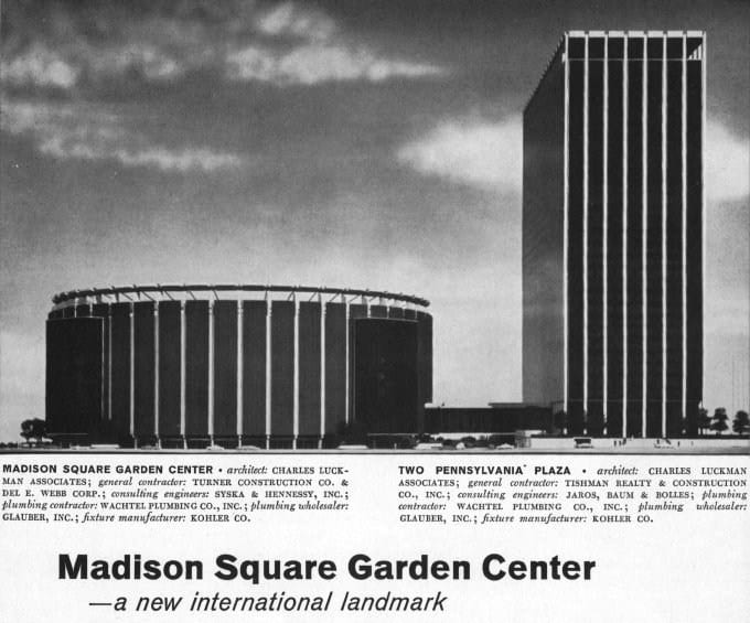
When New York Penn Station opened in 1910, the Pennsylvania Railroad boasted in advertisements that their vast new station was built of travertine marble from the same ancient Italian quarries as the Coliseum and Pantheon. Old Penn Station was rich in the architectural language of Greece and Rome. The façade comprised a colonnade of massive, Doric columns that stretched almost 450-feet end-to-end; it was inspired from temples on the Greek Acropolis. The main waiting room, at 314-feet-long, 109-feet-wide, and 150-feet-high, was modeled on Rome’s Baths of Diocletian. The project was as much an aesthetic gesture to the emerging City Beautiful Movement as it was a political statement: The Pennsylvania Railroad was here to stay, as permanent as the Penn Station it built.
The finished station, however, was an architectural contradiction. The Neoclassical exterior concealed what was, belowground, an extensive and, at-the-time, hyper-modern system of tunnels, electric trains, and communication systems that conveyed millions of people, baggage, and mail from street-level to each of 21 platforms. Aside from the solid stone columns of the main façade, most of the interior was of thin limestone, marble, and plaster sheets mounted on a metal structural frame. The seeming permanence of the stone walls was a cover for the steel frame and modern technology within on which this Neoclassical stage-set rested.

.

.

Just over fifty years later, on October 28, 1963, demolition began. The Pennsylvania Railroad, burdened with debt and aging infrastructure, was selling off its most profitable real estate assets – its land, buildings, and equipment – to stay afloat until it declared bankruptcy by 1970. Through the same two Hudson River tunnels that building materials for the original Penn Station were delivered, some of the same rubble now passed. Much of this rubble was carted off and dumped in the New Jersey Meadowlands adjacent the tracks where commuter trains still pass. The Pennsylvania Railroad used, quite literally, the station’s technology to cannibalize itself, and as the foundations for the new, and current, Penn Station.
Searching for remnants of old Penn Station, I found historic photos from the New York Public Library, Historic American Buildings Survey, and Library of Congress. I returned to the same locations in fall 2019 to re-photograph these images from the identical camera angles. The resulting and visible ghost of the lost Penn Station presents a strong-clear vision of what Penn Station used to be, and by extension, what it could return to, given financial commitment and political will.

.

Train concourse: past and present from the same location

.

The current subterranean warrens represent a clean break from what was here before. As long as Madison Square Garden chokes Penn Station for air and light from above, the current lightless and oppressive Penn Station is here to stay. The current station’s cheap ceilings of corrugated metal, garish electric signage, and exposed concrete floors ironically proved more durable than the Roman marble and limestone of old. The current station is not so fleeting and has, in fact, existed longer on this site than the station before it.
Surprising still is how, for many New Yorkers, it seems inconceivable that the permanent and imposing appearance of the original station could, one day, vanish without a trace. This old station is more dream than reality, and it seems almost impossible to imagine the current arrangement as having anything to do with what came before. So little of the original station – and the pride in civic life and New York City this station stood for – remains visible. Interestingly, more of the original architectural fabric survives belowground than meets the eye aboveground.

.

View from corner of 31st Street and 7th Avenue in 1962 and 2019. The structure is unrecognizable aboveground.

.

.

.

.

32nd Street entrance to waiting room in 1962 and 2019
The southeast corner of the still-standing General Post Office is in both frames, in the far left hand distance.

.

.

.

In the five years that demolition and rebuilding lasted (from 1963 to 1968), Penn Station remained in active service. While builders demolished the old station above, commuters continued to pass by on the platforms and corridors below. For this brief moment, the two buildings lived side-by-side, until the present building swallowed almost all visible traces of the past. In spite of this loss, the confusing floor plan of the current Penn Station has much to do with remaining traces of the original. Column for column and void for void, the current Penn Station is built within the fabric of the original. The old Penn Station, completed 1910, had 21 tracks on 11 platforms. The new Penn Station has 21 tracks on 11 platforms. In the demolition process, not one track or platform moved. In the five-year re-construction process, none of the tracks and platforms were moved, and most of the stairs between concourse and track-level survived. This similarity enables us to situate parts of the old structure in relation to the new.

.

Frame of new Penn Station rises simultaneous to the demolition of the old c.1963-68
Passengers in train concourse as new structural frame divides them from the soon-to-be-demolished glass canopy of the old station.

.

Train concourse before and after insertion of the new structural frame, from the same camera angle

.

.

.

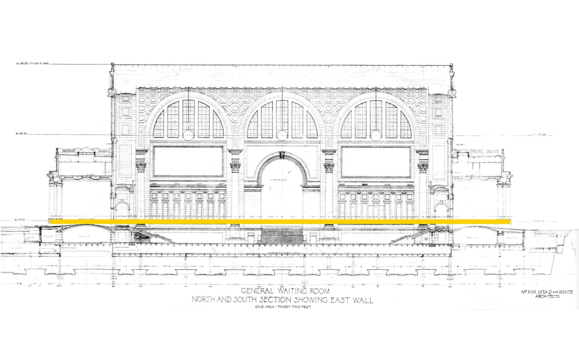
The above cross-section of old Penn Station’s waiting room shows the extent of change. The orange line indicates the elevation at ground-level to which the architectural fabric of the old building was demolished. Above this line, nothing of Penn Station survives. Below this line, most of the original structure, tracks, infrastructure, stairwells, and the general contours of the original rooms survive, except now hidden.
After the Roman Empire collapsed, its architectural monuments to empire and power fell into disuse; many were repurposed for more humble and practical purposes. The Coliseum became a stone quarry, the Roman Senate House a humble church, and the Theatre of Marcellus a medieval fortress. New purposes were developed in the shells of old monuments. When a building is reused and altered but still bears visible traces of its earlier form, architectural historians call this creation a palimpsest. A palimpsest is neither of the present nor of the past; it is a mixture of both. For instance, the two square fountains of the 9/11 Memorial in Lower Manhattan mirror the locations of the now-vanished Twin Towers. For a modern and young city in world terms, Penn Station is New York City’s largest palimpsest.

.

Shopping arcade in 1911 and 2019

.

.

View from 7th Avenue shopping arcade into the waiting room in 1911 and 2019

.

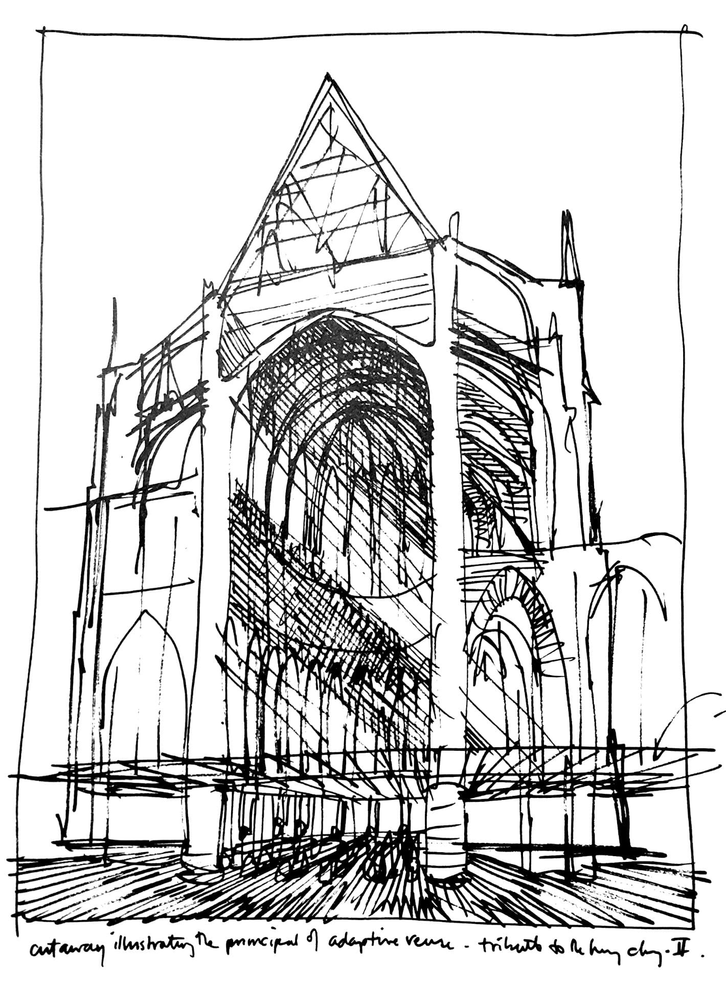
“Cutaway illustrating the principle of adaptive reuse.” Drawing by architectural children’s book illustrator, David Macaulay, proposes to discard the “non- functional” spaces of the medieval cathedral by erecting a Styrofoam drop ceiling just above the floor. Everything above – light, soundscape, and ornament is “superfluous” to the cathedral’s function.

The oppressively low ceilings of the current station are the structural division between the public areas belowground and the now private (formerly public) areas aboveground. These ceilings also align to the border between the infrastructure of the original station that survives and the architectural fabric that was lost.
The Pennsylvania Railroad made the decision that made the most economic sense: to keep the infrastructure beneath and decapitate the “non-functional” aesthetics of the soaring ceilings and open spaces aboveground. This was valuable land that could be put to more profitable use. Into these empty “air rights,” the corporation could insert Penn Station’s new functions of Madison Square Garden and office towers that would, at last, generate additional income. While exploring the station, I discovered this palimpsest valued the practical and made absolute economic sense: Who needs to enter the city on the scale of a titanic-sized god when humans require spaces no higher than 8-feet-high to pass through?

.

A cathedral with a drop ceiling

.

.

The shopping arcade in 1911 and 2019
Statue of Samuel Rea is in the shadows.

.

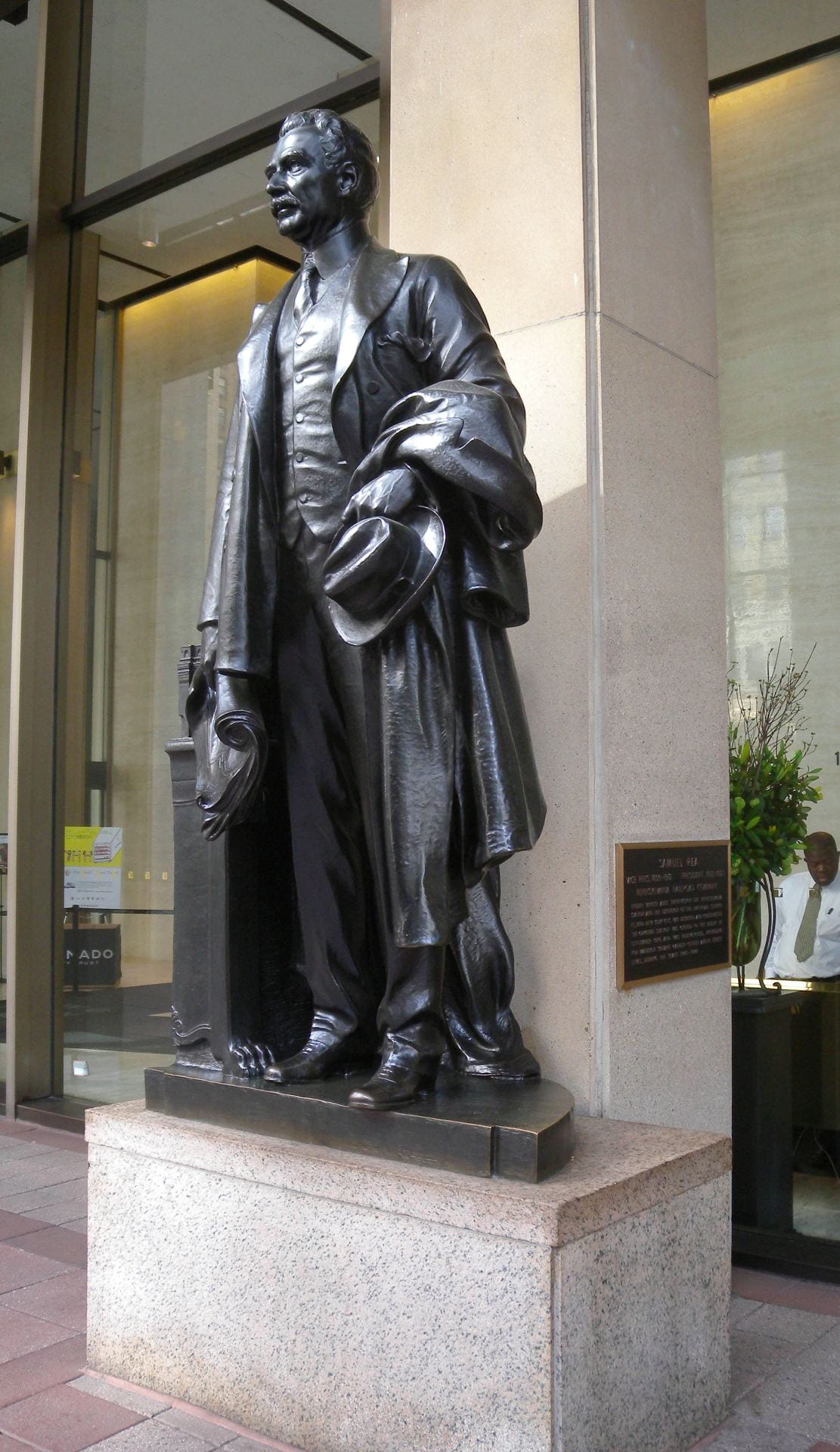
President Samuel Rea

The nuances of this palimpsest become clearer from inside the building. Passengers entering the old station proceeded down a long shopping arcade to the waiting room and platforms. What was once public space is now the private lobby of the commercial offices aboveground. On the right hand side, in the shadows of the private lobby, stands a statue of Samuel Rea, president of the Pennsylvania Railroad. A century ago, Rea stood at the entrance and welcomed passengers and the public; he now stands and watches the corporate clients and office workers. In old Penn Station, an inscription beneath announced his name and title. In the current location, Rea is out of place and has no relationship with his surroundings; the once prominent inscription is almost invisible on the new tablet behind him.

.

Statue of Samuel Rea is in the left hand niche.
Almost stone for stone, the location of the current waiting room escalator mirrors the location of the original.

.

.

Main entrance to waiting room: The left hand niche contains the statue of Alexander Cassatt, Pennsylvania Railroad president during construction.

.

.

The waiting room, once the largest indoor public space in New York City, is now a parking lot.

.

From the street-level arcade, passengers descended into the cavernous waiting room, sunken a few feet belowground. While the room itself is gone, the contours of this room survive in the general footprint of the sunken parking lot that now occupies the site. What was once public space is now private and patrolled by Madison Square Garden security guards who forbade me from standing at this location with my camera.

.

Perhaps, beneath this asphalt parking lot, fragments of the original waiting room floor remain.

.

.

Train Concourse

.

.

Train concourse, past and present.
White cutouts on the drop ceiling mirror the former locations of the demolished skylights.

.

.

.

.

.

.

This part of the train concourse is now the VIP entrance for spectators at Madison Square Garden.

.

The design problems with the current Penn Station are similar to those of old Penn Station: too few tracks, too many passengers, confusing circulation, and outdated infrastructure. After all, it is not the engineering and infrastructure that set these two buildings apart, as brick-for-brick and beam-for-beam, the 1960s rebuilding did not generally alter the areas belowground. This early-twentieth-century infrastructure was, after all, designed to handle no more than 200,000 passengers-per-day, and yet now struggles under the burden of 650,000-per-day. Instead, it is the envelope around this infrastructure that was rebuilt in the 1960s, and whose loss the public and historians now mourn.

.

.

At track-level, the railroad ties, location of the third rail, and support columns are original to 1910. The columns in the foreground were added in the 1960s to support the weight of Madison Square Garden. The columns in the distance are original to 1910. The 1960s modernist buildings above conceal below what is, in essence, early-twentieth-century infrastructure.

.

View from Track Six

.

Generations of New Yorkers hoped Penn Station would one day be restored with an architectural monument befitting New York City and the Western hemisphere’s busiest train station. In addition to rebuilding the General Post Office next door, other proposals over the years have called for rebuilding Penn Station exactly as it appeared before, or imagining a futuristic Penn Station emerging from the structural shell of the current Madison Square Garden, entitled “Penn Station Palimpsest.” Precedent exists for both proposals. Some post World War II cities rebuilt their monuments and bombed out city centers as they appeared before (such as Dresden and Warsaw), while others incorporated the rubble of the lost buildings into a modern building (such as Coventry Cathedral in England and Kaiser Wilhelm Memorial Church in Berlin). What we miss about old Penn Station was not the infrastructure, operations, or even the building itself, but rather the way this architecture made us feel dignified, and which we feel no longer.

Architecture of Redemption?

Contradictions of Solitary Confinement
at Eastern State Penitentiary

Master’s thesis at the University of Cambridge: Department of Art History & Architecture
Developed with Max Sternberg, historian at Cambridge

.

.

The perfect disciplinary apparatus would make it possible for a single gaze to see everything constantly. A central point would be both the source of light illuminating everything, and a locus of convergence for everything that must be known: a perfect eye that nothing would escape and a centre towards which all gazes would be turned.
– Michel Foucault

.

Abstract

Prison floor plan in 1836

In the contemporary imagination of prison, solitary confinement evokes images of neglect, torture, and loneliness, likely to culminate in insanity. However, the practice originated in the late-eighteenth- and early-nineteenth-century as an enlightened approach and architectural mechanism for extracting feelings of redemption from convicts.
This research examines the design of Eastern State Penitentiary, built by English-born architect John Haviland from 1821 to 1829 in Philadelphia, Pennsylvania. This case study explores the builders’ challenge of finding an architectural form suitable to the operations and moral ambitions of solitary confinement. Inspired by Jeremy Bentham’s panopticon, Haviland’s design inspired the design of over 300 prisons worldwide. With reference to primary sources and to philosophers Jeremy Bentham and Michel Foucault, this research interrogates the problematic assumptions about architecture and human nature encoded in the form of solitary confinement practiced at Eastern State Penitentiary, which has wider implications for the study of surveillance architecture.

.

Click here to read

Opens in new window as PDF

.

Acknowledgments

I am indebted to Max Sternberg for his attentive guidance throughout this research, and his support of my experience in providing undergraduate supervisions at Cambridge. I am grateful to Nick Simcik Arese for encouraging me to examine architecture as the product of labor relations and relationships between form and function. I am inspired by Alan Short’s lectures on architecture that criticize the beliefs in health and miasma theory. My research also benefits from co-course director Ronita Bardhan. Finally, this research is only possible through the superb digitized sources created by the staff of Philadelphia’s various archives and libraries.
I am particularly indebted to the guidance and friendship of Andrew E. Clark throughout my life.
The COVID-19 pandemic put me in a “solitary confinement state-of-mind,” allowing me to research prison architecture from a comfortable confinement of my own.

.

Related Projects

.

Digital Reconstruction
of Eastern State: 1836-1877

Digital Reconstruction
of Jeremy Bentham’s Panopticon

Exhibit on Prison Design
Research begun before MPhil

.


The Berlin Evolution Animation

Abstract: The Berlin Evolution Animation visualizes the development of this city’s street network and infrastructure from 1415 to the present-day, using an overlay of historic maps. The resulting short film presents a series of 17 “cartographic snapshots” of the urban area at intervals of every 30-40 years. This process highlights Berlin’s urban development over 600 years, the rapid explosion of industry and population in the nineteenth-century, followed by the destruction and violence of two world wars and then the Cold War on Berlin’s urban fabric.

.

.

.

Animation der Wandlung Berlins

Zusammenfassung: Auf der Grundlage von historischen Karten visualisiert die „Animation der Wandelung Berlins“ die Entwicklung des Straßennetzwerks und der Infrastruktur Berlins von 1415 bis heute. In diesem kurzen Video wird eine Serie von 17 „kartographischen Momentaufnahmen“ der Stadt in einem Intervall von 30 – 40 Jahren präsentiert. Dadurch wird die Entwicklung der Stadt Berlin über 600 Jahre, das rapide Wachstum der Industrie und Bevölkerung im 19. Jahrhundert, die Zerstörung und Gewalt der zwei Weltkriege und abschließend des Kalten Krieges auf Berlins Stadtbild verdeutlicht.

German translations by Richard Zhou and Carl von Hardenberg

.

Year, Event and Estimated Population
1415 – Medieval Berlin – 7,000
1648 – Thirty Years War – 6,000
1688 – Berlin Fortress – 19,000
1720 – Rise of Prussian Empire – 65,000
1740 – War with Austria – 90,000
1786 – Age of Enlightenment – 147,000
1806 – Napoleonic Wars – 155,000
1840 – Industrial Revolution – 329,000
1875 – German Empire – 967,000
1920 – Greater Berlin – 3,879,000
1932 – Rise of Fascism – 4,274,000
1945 – Extent of Bomb Damage – 2,807,000
1950 – Germania – World Capital
1953 – Recovery from War – 3,367,000
1961 – Berlin Wall – 3,253,000
1988 – A City Divided – 3,353,000
Contemporary – A City United
Census year
Jahr, Ereignis und geschätzte Anzahl von Bewohnern
1415 – Berlin im Mittelalter – 7,000
1648 – Der Dreißigjährige Krieg – 6.000
1688 – Die Festung Berlin – 19.000
1720 – Der Aufstieg des Königreichs Preußen – 65,000
1740 – Der Österreichische Erbfolgekrieg – 90.000
1786 – Das Zeitalter der Aufklärung – 147.000
1806 – Die Koalitionskriege – 155.000
1840 – Die industrielle Revolution – 329.000
1875 – Das Deutsche Kaiserreich – 967.000
1920 – Groß-Berlin – 3.879.000
1932 – Der Aufstieg des Faschismus – 4.274.000
1945 – Die Spuren des 2. Weltkrieges – 2.807.000
1950 – Germania – Welthauptstadt
1953 – Deutsches Wirtschaftswunder – 3.367.000
1961 – Die Berliner Mauer – 3.253.000
1988 – Eine geteilte Stadt – 3.353.000
Heute – Eine wiedervereinte Stadt
Jahr der Volkszählung

.

Methodology and Sources

I chose not to represent urban development before 1415 for three reasons: Firstly, there are too few accurate maps of the city before this time. Secondly, I needed to find accurate maps that had visual style consistent with later years, to enable easier comparison of development over time. Thirdly, the extent of urban development and population is limited (fewer than 10,000 Berliners).
There are numerous maps showing Berlin’s urban growth. Yet, few of them are drawn to the same scale, orientation and color palette. This makes it more difficult to observe changes to the city form over time. Fortunately, three map resources show this development with consistent style.
  1. The Historischer Atlas von Berlin (by Johann Marius Friedrich Schmidt) published 1835 represents Berlin in the selected years of: 1415, 1648, 1688, 1720, 1740, 1786. This atlas is available, free to view and download, at this link.
  2. After the year 1786, I rely on three books from cartographer Gerd Gauglitz:
    Berlin – Geschichte des Stadtgebietsin vier Karten
    Contains four maps of Berlin from 1806, 1920, 1988 and 2020. Read article.
    Berlin – Vier Stadtpläne im Vergleich
    Contains four maps from 1742, 1875, 1932 and 2017. Read article.
    Berlin – Vier Stadtpläne im VergleichErgänzungspläne
    Contains four maps from 1840,1953, 1988 and 1950. The last map from 1950 is speculative and shows Berlin as it would have looked had Germany won WWII and executed Albert Speer’s plans for rebuilding the city, named “Germania.” Read article.
    Gerd Gaulitz’s three map books can be purchased from Schropp Land & Karte.
  3. I also show the estimated extent of WWII bomb damage to Berlin. This map is sourced from an infographic dated 8 May 2015 in the Berliner Morgenpost. View original infographic. This infographic is, in turn, based on bombing maps produced by the British Royal Air Force during WWII (and Albert Speer’s c.1950 plan for Berlin).
Below is an interactive map I created of the Berlin Wall’s route and the four Allied occupation areas:

.

.

Population statistics in the 17 “cartographic snapshots” are estimates. The historical development of Berlin’s population is known for a few years. For other years, the population is estimated with regards to the two censuses between which the year of the “snapshot” falls.

New York City Water Supply: animated history

Developed with Gergely Baics, urban historian at Barnard College

.

New York City has some of the world’s cleanest drinking water. It is one of only a few American cities (and among those cities the largest) to supply unfiltered drinking water to nine million people. This system collects water from around 2,000 square miles of forest and farms in Upstate New York, transports this water in up to 125 miles of buried aqueducts, and delivers one billion gallons per day, enough to fill a cube ~300 feet to a side, or the volume of the Empire State Building. This is one of America’s largest and most ambitious infrastructure projects. It remains, however, invisible and taken for granted. When they drink a glass of water or wash their hands, few New Yorkers remind themselves of this marvel in civil engineering they benefit from.
This animated map illustrates the visual history of this important American infrastructure.

.

Sound of water and ambient music from Freesound

New York City is surrounded by saltwater and has few sources of natural freshwater. From the early days, settlers dug wells and used local streams. As the population grew, these sources became polluted. Water shortages allowed disease and fire to threaten the city’s future. In response, city leaders looked north, to the undeveloped forests and rivers of Upstate New York. This began the 200-year-long search for clean water for the growing city.

.

Credits

Gergely Baics – advice on GIS skills and animating water history
Kenneth T. Jackson – infrastructure history
Juan F. Martinez and Wright Kennedy – data

.

Interactive Map

I created this animation with information from New York City Open Data about the construction and location of water supply infrastructure. Aqueduct routes are traced from public satellite imagery and old maps in NYPL map archives. Thanks is also due to Juan F. Martinez, who created this visualization.
Explore water features in the interactive map below. Click color-coded features to reveal detail.

.

Watersheds   Subsurface Aqueducts   Surface Aqueducts   Water Distribution Tunnels   City Limits

.

▼ For map legend, press arrow key below.

.

Sources

.
For such an important and public infrastructure, the data about this water supply, aqueduct routes, and pumping stations is kept secret in a post 9/11 world. However, the data presented here is extracted from publicly-available sources online, and through analysis of visible infrastructure features on satellite imagery when actual vector file data or raster maps are unavailable from NYC government.
.
Contemporary Maps
NYC System and Shapefiles – Juan F. Martinez
Watershed Recreation Areas – NYC Department of Environment Protection (DEP)
General System Map – NY State Department of Environmental Conservation (DEC)
.
Historic Maps
.
Texts
Water Supply Fast Facts – NY State DEC
Encyclopedia of the City of New York – Kenneth T. Jackson
.
Animation music – Freesound
Audio narration – Myles Zhang

California Waterscape: time-lapse history of water supply

California Waterscape animates the development of this state’s water delivery infrastructure from 1913 to 2019, using geo-referenced aqueduct route data, land use maps, and statistics on reservoir capacity. The resulting film presents a series of “cartographic snapshots” of every year since the opening of the Los Angeles Aqueduct in 1913. This process visualizes the rapid growth of this state’s population, cities, agriculture, and water needs.

.

Music: Panning the Sands by Patrick O’Hearn

.

Dams and Reservoirs

^ Created with open data from the US Bureau of Transportation Statistics and visualized in Tableau Public. This map includes all dams in California that are “50 feet or more in height, or with a normal storage capacity of 5,000 acre-feet or more, or with a maximum storage capacity of 25,000 acre-feet or more.” Dams are georeferenced and sized according to their storage capacity in acre-feet. One acre-foot is the amount required to cover one acre of land to a depth of one foot (equal to 325,851 gallons or 1.233 ● 10liters). This is the unit of measurement California uses to estimate water availability and use.

.

.

Aqueducts and Canals

^ Created with open data from the California Department of Water Resources, with additional water features manually added in QGIS and visualized in Tableau Public. All data on routes, lengths, and years completed is an estimate. This map includes all the major water infrastructure features; it is not comprehensive of all features.


Method and Sources

The most important data sources consulted are listed below:

This map excludes the following categories of aqueducts and canals:

  • Features built and managed by individual farmers and which extend for a length of only a few hundred feet. These features are too small and numerous to map for the entire state and to animate by their date completed. This level of information does not exist or is too difficult to locate.
  • Features built but later abandoned or demolished. This includes no longer extant aqueducts built by Spanish colonists, early American settlers, etc.
  • Features created by deepening, widening, or otherwise expanding the path of an existing and naturally flowing waterway. Many California rivers and streams were dredged and widened to become canals, and many more rivers turned into “canals” remain unlined along their path. Determining the construction date for these semi-natural features is therefore difficult. So, for the purposes of simplicity and to aid viewers in seeing only manmade water features, these water features are excluded.
Download and edit the open source QGIS dataset behind this animation.

Manufacturing the Picturesque at Central Park

Written with Zeynep Çelik Alexander, historian at Columbia University
Inspired by Elizabeth Blackmar’s inspiring lectures on urban development and Central Park

.

Download this essay as a PDF file

.

Figure 1. Map of completed Central Park in 1873

.

Central Park is not only the major recreational facility of Manhattan but also the record of its progress: a taxidermic preservation of nature that exhibits forever the drama of culture outdistancing nature. Like the [Manhattan] Grid, it is a colossal leap of faith; the contrast it describes – between the built and the unbuilt – hardly exists at the time of its creation.
– Rem Koolhaas, Delirious New York1

.

Koolhaas presents one of the challenges core to Central Park’s construction: the tension between natural and manmade, urban and rural. What sets this park apart from most other parks is its yearning to seemingly become something that it clearly is not: natural. Many other pocket parks in this city incorporate existing topography and trees into their design – yet they are smaller. And from the confines of their interior, the sights and sounds of the city are hard to escape. Central Park succeeds in permitting its visitor to make-believe, at least momentarily, that they have left the city and are immersed in the countryside. The original park contained, for instance, a sheep pasture and barn, a nature preserve called “The Ramble,” and a dairy for urban mothers to buy fresh milk.
The scale of Central Park and the engineering that went into its creation is not unprecedented – architects and engineers have completed far larger infrastructure projects. The New York City watershed, for instance, catches all the rainfall within a 2,000 square mile area, stores this water in 19 reservoirs, and then transports this water up to 150 miles in underground pipes that serve nine million people.2 Central Park, by comparison, was built by some of the same engineers but is a mere three-square-miles of “improved” wilderness. However, what is surprising is the degree to which Central Park’s landscape features seem natural, as if land speculators and developers had chanced upon the park and left it as untouched as they had found it, except framed on four sides by the city grid (figure 5). So successful is this intervention that there is often the popular misconception that it is natural. This Huffington Post article, for instance: “I know that it may come as a shock to some, but New York’s Central Park is not an act of God. It might seem that way, especially in the woodlands, which appear so authentically, well, natural.”3

.

Figure 2. Earthworks projects in 1858, most likely in the vicinity of 72nd Street

.

In the 1857 text entitled “The Plan for the Park,” the project’s landscape architect, Frederick Law Olmsted (b.1822-d.1903), writes that it “seems desirable to interfere with its easy, undulating outlines, and picturesque, rocky scenery as little as possible, and, on the other hand, to endeavor rapidly and by every legitimate means, to increase and judiciously develop these particularly individual and characteristic sources of landscape effects.”4 Olmsted’s claim is a good place to start because it expresses a paradox central to the design. Olmsted’s project “interferes” with the landscape “as little as possible” simultaneously with large-scale efforts to move soil, blast rock, and plant trees that employed – at the height of work – some 4,000 men.5 Around five million cubic feet of rock and soil were blasted and removed from the park. Rem Koolhaas interprets this quote from Olmsted as follows: “If Central Park can be read as an operation of preservation, it is, even more, a series of manipulations and transformations performed on the nature ‘saved’ by its designers.”6
How can we reconcile these two seemingly opposed tendencies in Central Park – natural vs. manmade – when almost all manmade features are disguised as natural? I propose that we can better understand the park by dispensing with the pretense that it is in any way natural.
Central Park presents an unusually refined interpretation of nature. Of the approximately 20,000 trees of 175 species, solidly 60% are non-native to New York.7 Of the seven lakes contained within the park, none are natural to the terrain and are mostly the result of damning existing streams. Of the paths, trails, and roads winding through the park – with curves to match the contours of hills and valleys – none are original, nor do they correspond to pre-development dirt roads and Lenape Indian trails.8

.

Figure 3. Frederick Law Olmsted’s 1857 drawing of the park before and after the planned “improvements.”
The style and content of this image evokes the work of English landscape architects and Humphry Repton.

.

Before work began in 1857, the pre-development topography was insufficient for use as a public park. The Manhattan grid – comprising some 2,000 plus city blocks each measuring exactly 200 feet wide – implies a flat terrain and originally made no accommodations for interfering rivers, hills, or marshes. Looking at a street map of the island, one might be surprised to learn that the terrain rises and falls the length of the island from zero feet at sea level to ~250 feet at its highest peak (figures 4 and 16).9 The name “Manhattan” is a Lenape Indian word that means “Island of Many Hills.”10 Yet, despite the variety of sites planners could have chosen from, the park’s rectangular boundaries were not determined by the availability of topographic features appropriate for a park.

.

Figure 4. British Headquarters Map of Manhattan Island from c.1789. Only the shaded pink section at top of island is developed at city-level density. The rest consists of rolling hills, forest, and farmland that inspired Henry Hudson, the first European who “discovered” the island in 1609, to remark that: “The land is the finest for cultivation that I ever in my life set foot upon.”11

.

Instead of topography, three main factors determined the location: First, planners needed to choose a site close to the expanding city yet far enough away that the land could be acquired cheaply and without displacing large numbers of residents. Second, the city’s population had grown 160% in the twenty years from 1840 to 1860,12 and the city’s existing Croton reservoir (then located in the exact center of the proposed park) was insufficient. The city needed an expanded reservoir; the most convenient location on Manhattan Island for this reservoir was next to the existing one. The otherwise purely practical infrastructure of water supply could thus become a landscape feature.13 Third, the city planned to offset the approximately five-million-dollar price tag of land acquisition and construction through corresponding increases in the taxable property values of land adjacent the park. The architects also went so far as to suggest “a toll of three cents on visitors coming on foot, and six cents for all others” collected on visitors to fund park maintenance and offset construction costs. (This was never implemented.)14 Olmsted also writes:
Land immediately about the Park, the frontage on it being seven miles in length, instead of taking the course anticipated by those opposed to the policy of the Commission, has advanced in value at the rate of two hundred per cent per annum. […] It is universally admitted, however, that the cost, including that of the original off-hand common sense blunders, has been long since much more than compensated by the additional capital drawn to the city through the influence of the Park.15
The park’s location might be strengthened by the simple fact that a linear or smaller park along the waterfront would have fewer miles of frontage of taxable properties adjacent to the park. For instance, locating just one side Central Park along the Hudson and East River (instead of the island’s center) would result in 2.5 miles fewer of abutting properties. Within the following decades, the properties in the Upper East and Upper West Side that overlook the park became (and remain) among the most expensive in the city. This method of development – sacrificing a fraction of the land for park use so as to increase the monetary value of the adjoining lands – was common in New York City (e.g., Gramercy Park) and particularly in London’s fashionable West End and Hyde Park neighborhoods.16 What makes Central Park different, though, is the unprecedented scale of this investment to boost civic pride and to increase property taxes.

.

Figure 5. A c.1836 engraved map of mid-Manhattan with the outline of the future park drawn in orange ink c.1858. The incongruity between the park’s outline and the topography is also illustrated by the fact that the park’s northern boundary (originally at 106th street) would require blasting through a one hundred foot high solid-rock mountain to make way for the perimeter street.

.

Given these priorities – real estate and infrastructure interests over aesthetics – the choice of location was not ideal (figure 5). The rough terrain was mostly barren of trees and was a mosquito-laden wetland. (More readily converted and forested terrain was originally proposed along the East River in the vicinity of Roosevelt University.) Before beginning the architect’s work of planting trees and building scenic garden features, the first major task was to prepare the land and make it suitable for public use. To that effect, Olmsted contracted the engineer (and later military coronel) George E. Waring to drain the swamp. Waring directed 400 men to construct some 105,000 linear feet (32 kilometers) of drainpipes over two years (figure 8).17 His military-style approach toward clearing the park followed him into later life when he became New York City’s sanitation commissioner. As commissioner, he required all his street cleaners to wear white pith helmets (identical to those worn by European colonists in Africa) and then declared the war on filth. Given his interest in sanitation and dislike of dirt, his answer to the park commissioners’ question is revealing:
Commission’s Question: “To what degree shall the park be drained?”
Waring’s Answer: “Totally.”
Q: “By what form of drains?”
A: “Earthenware, of varying calibers.”
Q: “At what depth?”
A: “Three feet in open glades, four feet in forested areas.”
Q: “For best economy, by contract or days’ work?”
A: By days’ work because of the endlessly varied conditions requiring uncommon on-site super vision.”18

.

Figure 6. Buried Pipes in Connection with the New Reservoir, c.1862.

.

Figure 7. General View of North Reservoir from 102nd Street, 23 October 1862.
All the land visible here is now buried beneath the reservoir.

.

Another requirement asked of the planners was to incorporate a new reservoir into the park (figures 6-7 show terrain now flooded beneath reservoir). The existing stone reservoir and Croton Aqueduct, completed 1842, were no longer sufficient19 despite Walt Whitman’s claim that: “Ages after ages these Croton works will last, for they are most substantial than the old Roman aqueducts.”20 To augment the Croton’s capacity, the new reservoirs combined covered approximately 20% of the park’s surface area over terrain that otherwise would have become parkland. Before Olmsted had even submitted his plan in 1857, the engineer Egbert L. Viele, who had been surveying the parkland since 1853,21 had decided on placing this reservoir on a natural depression in the land, to be augmented by an earthen embankment around the perimeter. Olmsted’s final proposal follows the contours of Viele’s proposed reservoir exactly – illustrating the degree to which engineering needs dictated the landscape architect’s choices.

.

Figure 8. Map of drainage system on lower part of the Central Park as far as completed up to 31 December 1858. On the left is 59th Street, 5th Avenue is at bottom, and 8th Avenue (i.e. Central Park West) is at top. This map only illustrates the paths of future carriage roads within the park – that is, the thick white lines that wind through the landscape. Red lines indicate the buried clay pipes that drain water from the marshy soil – and many continue to do so today. Shaded gray areas correspond to areas to be raised with dirt fill. The shaded blotches are for preserved boulders protruding above ground. The slightly off-kilter rectangle in center is for the area drained to create the Central Park Mall – the only geometrically symmetrical part of the park.

.

Although the park was extensively surveyed and re-landscaped there was, nonetheless, an attempt to appear rustic and unkempt. The architect, Calvert Vaux, blanketed the park in little pavilions and bridges made from unpolished and rustic wood with bark still on the beams – a nineteenth-century re-reading of the primitive hut.22 The passage from the southern to the northern reaches of the park was also a parable in the march of civilization and progress. By this time, the city was advancing northward up the island from its historic center in Lower Manhattan (figure 9). Within forty years, the island would be completely built-up. With this recognition of urban sprawl, Olmsted named the park’s 16 original entrances to reflect the city’s movement and types of people living in New York. In order from south to north, the names are as follows: Artisan’s Gate, Merchant’s Gate, Scholar’s Gate, Woman’s Gate, Inventor’s Gate, Miner’s Gate, Mariner’s Gate, Engineer’s Gate, Gate of All Saints, Woodman’s Gate, Boy’s Gate, Girl’s Gate, Stranger’s Gate, Warrior’s Gate, Farmer’s Gate and Pioneer’s Gate. This list almost reads as a list of social classes in increasing order of proximity to raw nature.23 The design features also evolve over distance. The southern reaches (also the busiest section due to the proximity to the city center) was built first and included more pruned botanic features, rectangular parterres of trees, and the proposed flower garden. Olmsted thought it appropriate to leave the northern reaches of the park as wooded as possible with a c.1812 fortress left standing atop a mountain as a picturesque ruin in the style of English garden follies. The northern reaches (also surrounded mostly by farmland at this time) were intentionally more heavily forested, had fewer of the park’s signature bridges, retained the park’s largest rock escarpment, and for the first few decades of its life contained no statues, monuments, or plaques commemorating important people. By contrast, about two dozen monuments to Western Civilization’s great cultural and political leaders (all male) were concentrated in the south: William Shakespeare (installed 1872), Thomas Moore (1879), Alexander Hamilton (1880), Beethoven (1884), Columbus (1894), etc.24 Paradoxically, while the south may appear more refined and cultivated than the north, the pre- development terrains in both sections were equally crafted and manipulated. There is, here, the illusion of moving north toward nature, instead of the reality.

.

Figure 9. The extent of northward marching urban development by 1857, with the park beyond the developed city. Notice how large the park is relative to the city’s surface area, and how the city becomes rural travelling north. View this animation online.

.

At this stage, we might arrive at a better understanding by shifting the descriptive language. Perhaps we should describe the park not in terms of nature or landscape – given that considerations of the natural were not foremost in the design. We might do better to describe the park in terms of infrastructure, engineering, movement, and social class. Indeed, one of the strengths of Olmsted’s proposal – and one of the reasons he won out of the 33 designs submitted – was his decision to separate the park by four different social classes and speeds of movement (figures 10 and 11), each of which corresponded to a width of road and minimum permitted vehicle turning radius (color-coded in figure 12).25 This detailed plan for road separation and drainage were finished before the architects had even begun working on planting diagrams or selecting which species of trees would make for the most varied landscape composition. There were four classes of segregated roads. First, because of the park’s length, size, and location, there would be many vehicles passing through the park, not for leisure, but simply to pass from one side of the park to the other as fast as possible. For these vehicles, the engineers planned four buried transverse roads with entirely separate right-of-way. These straight and wide roads at no point intersected other types of traffic and were entirely below grade level. Second, there were carriage roads for slightly slower carriage traffic within the park. While the relatively straight transverse roads were for practical through-traffic, these carriage roads were for leisure. Third, the next highest speed consisted of a narrower and more curving path than the carriage roads, gravel paths for horseback riders. Horseback riding was a popular leisure and sporting activity – these roads are now largely used for joggers who move faster than pedestrians but slower than vehicles. Fourth, the most ubiquitous road type of all consisted of unpaved footpaths for pedestrians on foot only. With the help of bridges and tunnels (figure 11), at no point did these four systems of conveyance intersect, leading Olmsted to claim: “By this means it was made possible, even for the most timid and nervous, to go on foot to any district of the Park designed to be visited, without crossing a line of wheels on the same level, and consequently, without occasion for anxiety and hesitation.”26

.

Figure 10. Author’s diagram of road types

.

Figure 11. 1862 cross-section of transverse road. Notice how the trees above the road are drawn small, as if to exaggerate the tunnel’s monumentality.

.

WALK          RIDE          DRIVE          TRANSVERSE

Figure 12.

.

Incidentally, these separate and unequal paths also corresponded to different social classes. The wealthiest individuals – those who could afford a carriage, horse, and driver – would implicitly have exclusive use of the carriage roads, while horseback riders had their separate right of way, and service vehicles were segregated below grade. The rest of the public and working classes were restricted to the footpaths, where security guards patrolled the park and prohibited them from loitering, picking flowers, picnicking, or forming large groups. Elizabeth Blackmar and Roy Rozenzweig write: “In the decade after the opening, more than half of those visiting the park arrived in carriages (which less than 5 percent of the city’s population could afford to own, and each day there were elaborate carriage parades in the late afternoon.”27 Yet, disproportionate design considerations and park surface area seems to be given to this minority of users on carriages. We should return here to the fact that city leaders intended this park to boost property values and taxes on the wealthy residents who lived adjacent to the park. It is only natural, then, that the park design should reflect their interests and preferences.

.

.


Figure 15. Map of middle section of the park between the 79th Street and 97th Street transverse roads, the empty area at lower left hand corner is the future site of the Metropolitan Museum of Art. The blue road corresponds to the horseback trail, now jogging path. After starting at the 59th Street entrance and passing through manmade forests, valleys, and tunnels, horseback riders’ visual experience culminated as they circled this manmade reservoir.

.

These maps of the park – color coded by road type – can help us begin to unravel the degree to which the current landscape is manmade. At first glance, the smooth passage of roads and their organic contours may seem effortless, as if they were laid out along existing roads with regards to existing topography. By separating the different grades of traffic by color (figure 14) and upon closer examination, there is a complex and extensive hidden infrastructure beneath these natural appearances (figure 13).

.

Figure 16. 1811 Commissioners’ Plan

.

These maps also reveal a park that is not separate from or opposite to the city, but instead a continuation of the city. A glance at a map of Manhattan reveals two seemingly different philosophies of urbanism, as imprinted through the laying of road networks. Most of the island is covered in the orthogonal 1811 grid (figure 16). This grid gives no consideration to topography, nature, or aesthetics. Then, there is the three square mile area of Central Park with winding and seemingly organic roads. The absence of symmetry and straight lines might lead one to conclude that the park reflects an attempt to harmonize with nature. Existing popular literature commonly situates this park as a reaction to the grid’s perceived faults and excesses. Upon closer examination, this park’s near obsessive attention to detail, its concern with segregated movement, and its reliance on complex (but hidden) infrastructure reveal the park to be a continuation of the 1811 grid’s interest in real estate, property values, and engineering, more than it is a prosaic and romantic reaction to excessive urban growth. This infrastructure is also wrapped up in a coded message about the progress of civilization. The passage from cultivated south to rugged north can read as a condensed representation of the passage from the center of civilization to its undeveloped edges. One should also keep in mind that simultaneous to the construction of Central Park, engineers and developers were at work on the other side of the country clearing the American West for development. Within the following decades, the extent of farmed land would creep westwards on former Indian soil, generally following the paths of railroads toward California. Does the design of Central Park mirror 1860s American society’s belief in the civilizing power of science and technology to tame the wilderness? Alternatively, is Central Park’s design just a matter-of-fact effort to boost the city’s tax revenues, with no moral agenda intentionally encoded in the park design? Such questions might be impossible to answer, given the lack of conclusive evidence.
Now is the time to return to the question we started with: How can we reconcile these two seemingly opposed tendencies – natural vs. manmade? I posit that by describing Central Park in the language of infrastructure and real estate – instead of nature and aesthetics – we can arrive at a more accurate assessment of the park’s origins, objectives, and construction process. Seemingly, the only way to adapt this ill-suited site into a park that fulfilled the nineteenth-century definition of the picturesque was through public works that, upon their completion, effaced almost all traces of the people, trees, and landscape that existed before. The engineering here succeeds insofar as it is invisible and functions as if no manmade intervention had ever occurred. While at work, Olmsted made this prediction on the future of Manhattan Island:
The time will come when New York will be built up, when all the grading and filling will be done, and when the picturesquely-varied rock formations of the Island will have been converted into formations for rows of monotonous straight streets, and piles of erect buildings. There will be no suggestion left of its present varied surface, with the single exception of the few acres contained in the Park.28
The park is an architectural contradiction. On the one hand, its rock formations, hills, and valleys look to a pre-developed and rugged Manhattan in the public imagination, a landscape more fictive than real. On the other hand, the park’s very presence is a testament to the power of real estate interests, engineers, and the water supply board in shaping the city. This tension underlies the landscape features now almost universally praised for their vision, beauty, and harmony.

.

.

List of figures

  1. Lionel Pincus and Princess Firyal Map Division, The New York Public Library, “Map of the Central Park” New York Public Library Digital Collections, http://digitalcollections.nypl.org/items/4e6a6080- 3569-0134-549e-00505686a51c (retrieved 4 May 2019).
  2. Art and Picture Collection, The New York Public Library, “View in Central Park, Promenade, June 1858,” New York Public Library Digital Collections, http://digitalcollections.nypl.org/items/510d47e1- 0fb6-a3d9-e040-e00a18064a99 (retrieved 4 May 2019).
  3. Frederick Law Olmsted and Calvert Vaux (designers); Calvert Vaux (artist), Greensward Plan presentation board with “Present Outlines” (above) and “Effect Proposed” (below): No. 1. From Point A (view at Fifth Avenue entrance), 1858, graphite, wash and white lead on paper, New York Municipal Archives.
  4. Lionel Pincus and Princess Firyal Map Division, The New York Public Library. “Map of New York City and of Manhattan Island with the American defences in 1776,” New York Public Library Digital Collections, http://digitalcollections.nypl.org/items/ee2f1060-d488-0135-3577-67321a8090bc (retrieved 4 May 2019).
  5. David H. Burr (cartographer), Topographical Map of the City and County of New-York and the Adjacent Country (proof impression of center sheet), published by J.H. Colton and Co., New York, 1836, engraving, ca. 1836, the Metropolitan Museum of Art.
  6. Rare Book Division, The New York Public Library, “Pipes in Connection with the New Reservoir,” New York Public Library Digital Collections, http://digitalcollections.nypl.org/items/510d47e3-6289- a3d9-e040-e00a18064a99 (retrieved 4 May 2019).
  7. Rare Book Division, The New York Public Library, “General View of N. Reservoir from 102nd St. October 23, 1862,” New York Public Library Digital Collections, http://digitalcollections.nypl.org/items/510d47e3-6288-a3d9-e040-e00a18064a99 (retrieved 4 May 2019).
  8. Lionel Pincus and Princess Firyal Map Division, The New York Public Library, “Map of Drainage System on Lower Part of the Central Park as far as completed up to December 31st, 1858,” New York Public Library Digital Collections, http://digitalcollections.nypl.org/items/7fe3e680-0c6a-0132-bc3c- 58d385a7bbd0 (retrieved 4 May 2019).
  9. Author’s illustration from Here Grows New York animation, https://youtu.be/f6U7YFPrz6Y?t=226 (retrieved 5 May 2019).
  10. Author’s diagram of road types
  11. Calvert Vaux (architect), W.B. Swan (delineator), and Sarony, Major, and Knapp (lithographers), Bridge “E” over Transverse Road No. 2, 1861, lithograph, from Fifth Annual Report of the Board of Commissioners of the Central Park, January 1862, the Metropolitan Museum of Art.
  12. “Map of the Central Park” New York Public Library Digital Collections, 1873, modified by author with blue, red, and green color-coding.
  13. “Map of Drainage System on Lower Part of the Central Park as far as completed up to December 31st, 1858.”
  14. 1873 map of Central Park, color-coded by author to indicate types and widths of roads
  15. Ibid.
  16. Manuscripts and Archives Division, The New York Public Library, “Plan of Manhattan Island,” New York Public Library Digital Collections, http://digitalcollections.nypl.org/items/26e27e80-be8a-0131- bf1a-58d385a7bbd0 (retrieved 4 May 2019).
  17. Irma and Paul Milstein Division of United States History, Local History and Genealogy, The New York Public Library, “Central Park Tunnel,” New York Public Library Digital Collections, http://digitalcollections.nypl.org/items/a44288b4-9bdc-b31f-e040-e00a18060314 (retrieved 5 May 2019).
  18. Rare Book Division, The New York Public Library, “Men standing on Willowdell Arch,” New York Public Library Digital Collections, http://digitalcollections.nypl.org/items/94b7acd9-dc81-74f7-e040- e00a18063585 (retrieved 5 May 2019).

.

Works cited

  1. Rem Koolhaas, “Prehistory,” in Delirious New York (New York: The Monacelli Press, 1994), p.21.
  2. Kenneth Jackson, Lisa Keller, et al., “Water Supply,” in The Encyclopedia of New York City (New Haven: Yale University Press, 2010), p.1381-86.
  3. Charles A. Birnbaum, “The Big Task of Managing Nature at New York’s Central Park,” The Huffington Post, 12 September 2012, https://www.huffpost.com/entry/an-unlimited-range-of-rur_b_1870450? (retrieved 15 May 2019).
  4. Kenneth Jackson and David Dunbar (editors), “Selected Writings on Central Park, Frederick Law Olmsted (1858, 1870),” in Empire City: New York through the Centuries, (New York: Columbia University Press, 2002), p.279. This anthology of urban history assembles various primary sources from across NYC history into a single book.
  5. Ibid., “Central Park,” p.222-24.
  6. Rem Koolhaas, Delirious New York, p.23.
  7. Robert Demcker, “Central Park Plant List and Map Index of 1873,” published by the Frederick Law Olmsted Association and The Central Park Community Fund, 1979.
  8. Concluded from comparing maps of the park pre and post construction.
  9. Hilary Ballon, “Introduction,” in The Greatest Grid: The Master Plan of Manhattan 1811-2011 (New York: Columbia University Press, 2012), p.13-15.
  10. Eric Sanderson et al., The Welikia Project, https://welikia.org/about/how-it-all-began/ (retrieved 15 May 2019). – Sanderson created the most detailed visualization of Manhattan’s pre-development topography.
  11. “Early Descriptions of New Netherland,” New Netherland Institute: Exploring America’s Dutch Heritage, https://www.newnetherlandinstitute.org/history-and-heritage/additional-resources/dutch-treats/early-impressions-of- new-netherland/ (retrieved 15 May 2019).
  12. “NYC Total and Foreign-born Population 1790 – 2000,” NYC Planning Department, https://www1.nyc.gov/site/planning/data-maps/nyc-population/historical-population.page (retrieved 15 May 2019).
  13. The old rectangular shaped Croton Reservoir covered 8% of the park’s area. The new reservoir covered about 12%. Combined they covered 20%. Values calculated by author using Google MyMaps.
  14. Frederick Law Olmsted and American Social Science Association, Public Parks And the Enlargement of Towns: Read Before the American Social Science Association At the Lowell Institute, Boston, Feb. 25, 1870, (Cambridge: Printed for the American Social Science Association, at the Riverside Press, 1870), p.35. https://catalog.hathitrust.org/Record/008726621 (retrieved 4 May 2019).
  15. Ibid., p.35.
  16. Jon Campbell and Christopher Robbins, “The Origin Story Of Gramercy Park Is A Classic NYC Tale Of Real Estate Hucksterism, Cronyism, And Gate Crashing,” The Gothamist, 28 June 2018, http://gothamist.com/2018/06/28/gramercy_park_history_amazing.php (retrieved 15 May 2019).
  17. Morrison H Heckscher, “Creating Central Park,” The Metropolitan Museum of Art Bulletin, New Series, 65, no. 3 (2008): p.40, http://www.jstor.org/stable/25434142 (retrieved 15 May 2019).
  18. Ibid.
  19. A mere 94 years after opening, the old Croton reservoir was deemed inadequate, drained of water, and filled with debris from subway excavations.
  20. “Murray Hill Reservoir, November 25, 1849, Walt Whitman,” in Empire City, p.207.
  21. “Creating Central Park,” p.18.
  22. Patricia Heintzelman for the U.S. Department of the Interior, Central Park Nomination Form for NRHP, 1966, https://npgallery.nps.gov/AssetDetail/NRIS/66000538 (retrieved 15 May 2019).
  23. To my knowledge, the claim that Olmsted named the gates in 1862 to mirror the transition from civilization to nature has never been made before. However, Olmsted describes in writing how the terrain should evolve from smooth to rough during the passage north; it follows for naming conventions to reflect this shift.
  24. Wikipedia assembles lists of monuments, parks, streets, etc. organized as metadata with lat-long coordinates. Plotting these coordinates on a map and eliminating recently added monuments reveals a clear spatial concentration of artwork and sculpture in the south. https://en.wikipedia.org/wiki/List_of_sculptures_in_Central_Park (retrieved 16 May 2019). Identical list also found from NYC Parks Department: https://www.nycgovparks.org/parks/central- park/monuments (retrieved 16 May 2019).
  25. Landmarks Preservation Commission, Central Park Designation Report for the NYC Planning Department, 1974, http://s-media.nyc.gov/agencies/lpc/lp/0851.pdf (retrieved 15 May 2019).
  26. “Selected Writings on Central Park, Frederick Law Olmsted (1858, 1870),” in Empire City, p.281.
  27. “Central Park,” in The Encyclopedia of New York City, p.223.
  28. “Selected Writings on Central Park, Frederick Law Olmsted (1858, 1870),” in Empire City, p.279.